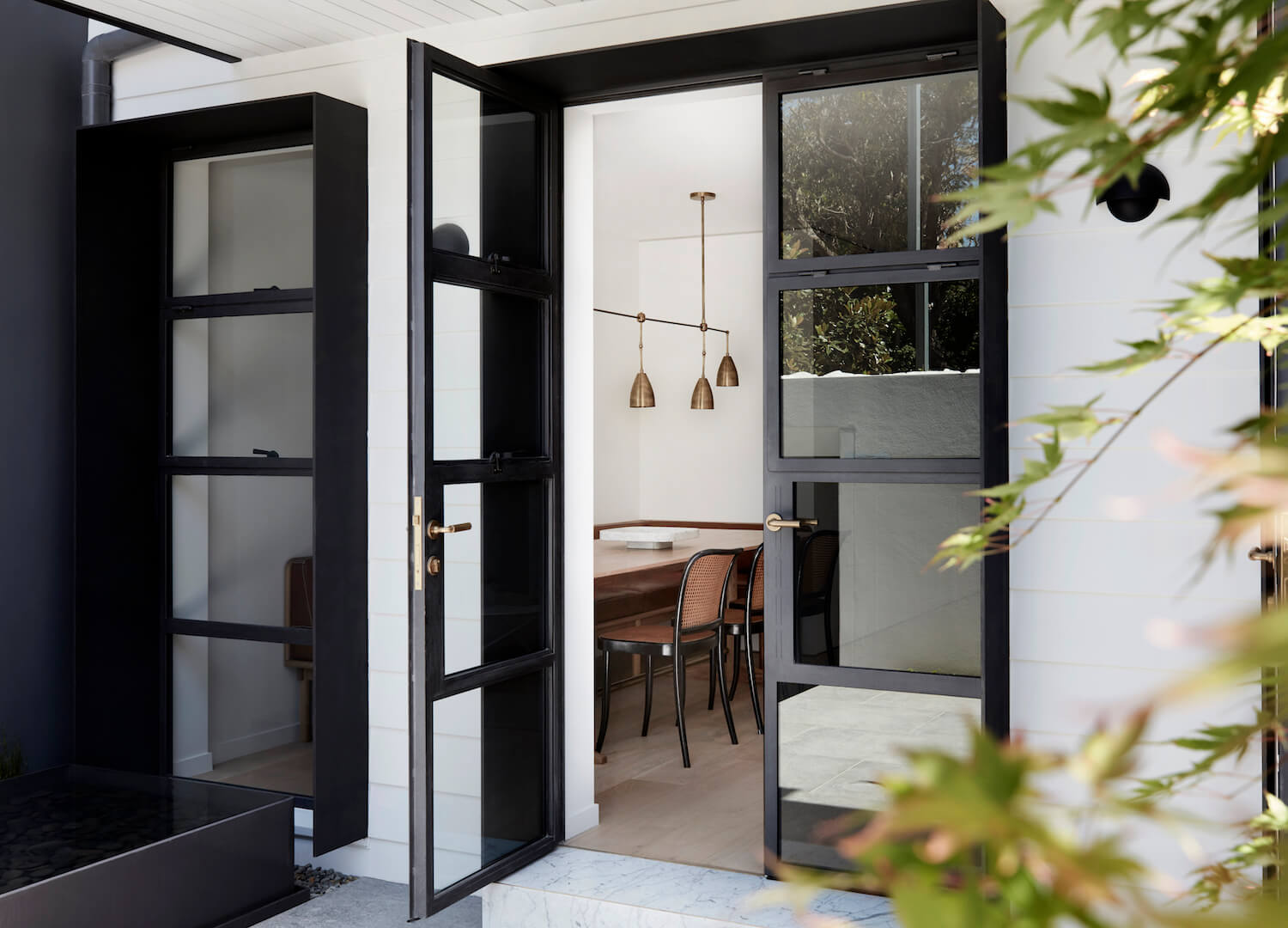
House Tour. Style In The Simplicity & Details


Inspired by a new potential project I may be taking on (more on that soon!), I was revisiting this home that I came across on Est Magazine a while back and realized I never shared it here. While the interior design itself is quite simple (and lovely!), the details in every room are incredibly on point. Together, they prove that there is, indeed, so much style to be had in quiet moments at home.


Much like our east coast brownstones, this 18th century terrace in Sydney is laid out like a row house. Its three stories host a small living space on the main floor, a lovely landing on the middle floor, and a grand bedroom on the top floor. In remodeling the space, some of the historical details were preserved, but more modern elements and architecture mixed in at the same time, resulting in the type of space I find ideal!


The decor in is right up my alley too: a mix of oak, cane, leather, linen, brass and marble. All of my favorite elements in one room!! The style is clean and laid back. While it feels a bit on the stark side (perhaps some playful art would help?), the foundational pieces in every room are spot on for me.


While you can tell that a great attention to detail has been made throughout the home, it’s the staircase that originally captured my heart!! Ok, and the insanely tall archways, too. But, can we please talk about the brass detail!??


Up the stairs, on the second floor landing is a lovely little seating area. I love secondary spaces like this in a home: they could be anything! I imagine I’d end up using it as an office or a cozy TV room. I’m completely jealous that there is another fireplace here!


Upstairs, the master bedroom has become quite modern, with a row of built-in closets that honestly aren’t my favorite, but are definitely practical. I think I would have had the doors made to feel more like antique cabinetry than the stark white, since the rest of the room is quite simple.


There is yet another fireplace in here, and I just can’t handle my envy! And also a stunning balcony that features some incredible ironwork detail!! Check out the exterior of this home. It feels like something out of the French Quarter in New Orleans to me!


And then there’s the bath. With floor to ceiling marble, this space is pure luxury! The layout seems to be optimizing the use of space in here, although I’m not sure how much I like the mirror jammed in between the two windows, and the sink so close to the tub. Would you have done the same? I suppose that the sacrifice may be worth it to have all the elements you want in here…
Personally, I think I would have opted for a double vanity, no bath, and this heavenly double shower head situation!
Getting this lovely mix and look in your own home is just as simple as can be when it comes to the decor side. Having all this gorgeous detail, though? That’s quite another. I supposed we’ll all have to dream for now, but in the meantime, here’s how to get the look!

1. brass chandelier | 2. vase | 3. dough bowl | 4. cane chair | 5. mirror | 6. white sconce | 7. leather chair | 8. jute rug


